This guide will explore the three essential spacing types - Gap, Padding, and Margin - and provide practical guidance on using them effectively in AppMaster Studio during the application design.
Overview
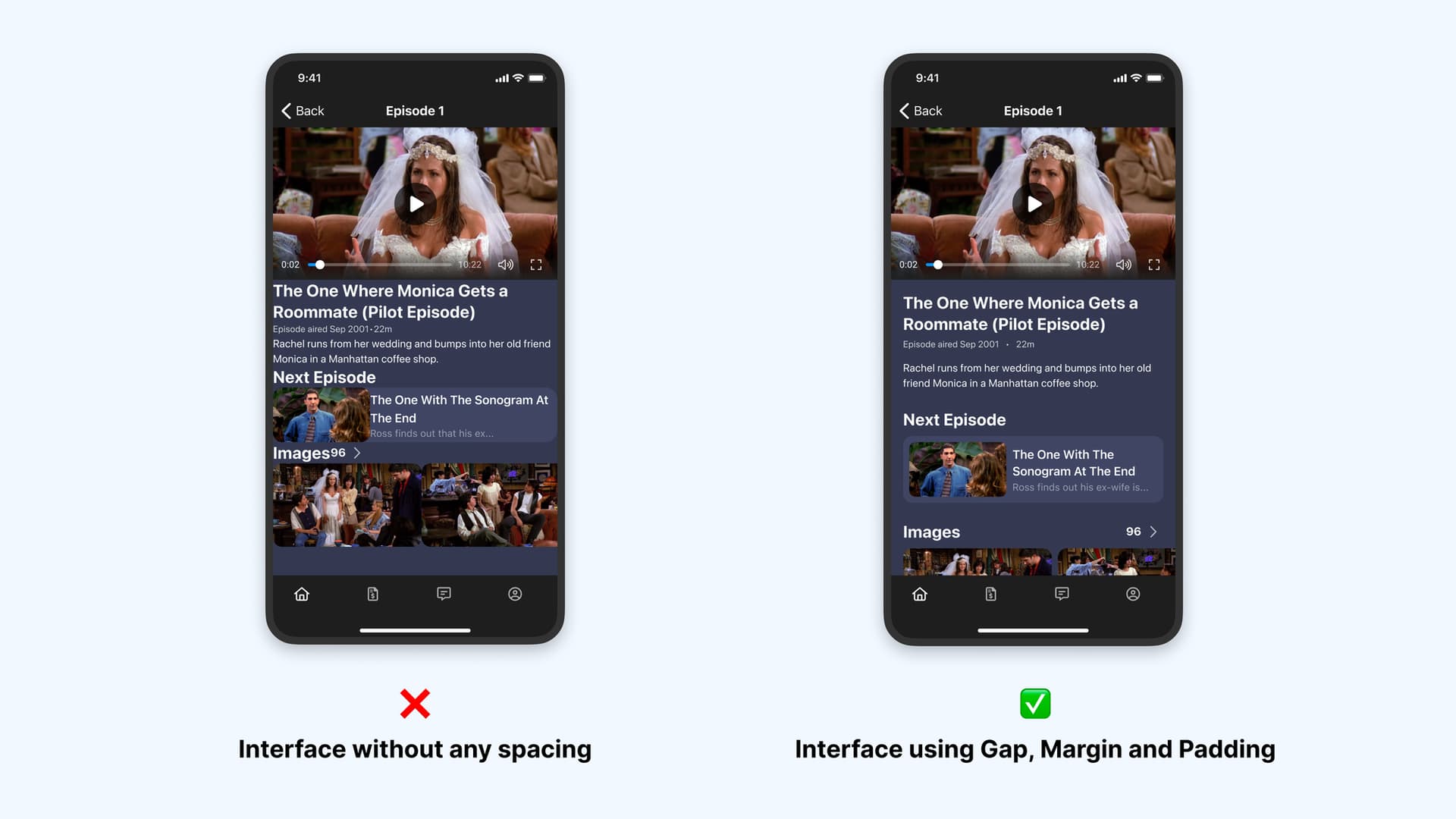
Spacing is a key element in UI design that plays a critical role in creating separation or unity between design elements. Proper spacing usage enhances visual perception speed and ensures information is presented logically and easily, allowing viewers to navigate the content quickly. By implementing spacing, you can create a sense of order and structure that guides the viewer’s eye through the design.
Today, we will discuss the significance of Gap, Padding, and Margin in creating a clean and functional design in AppMaster Studio.
Despite their initial similarities, each type of spacing plays a distinct role in producing a clean and functional design. With this article, you will explore the individual features of each of these types. Let’s go!
Gap
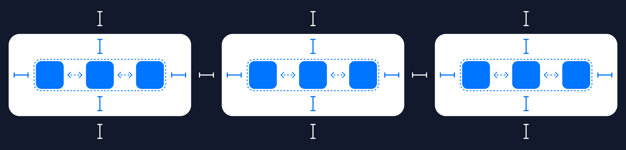
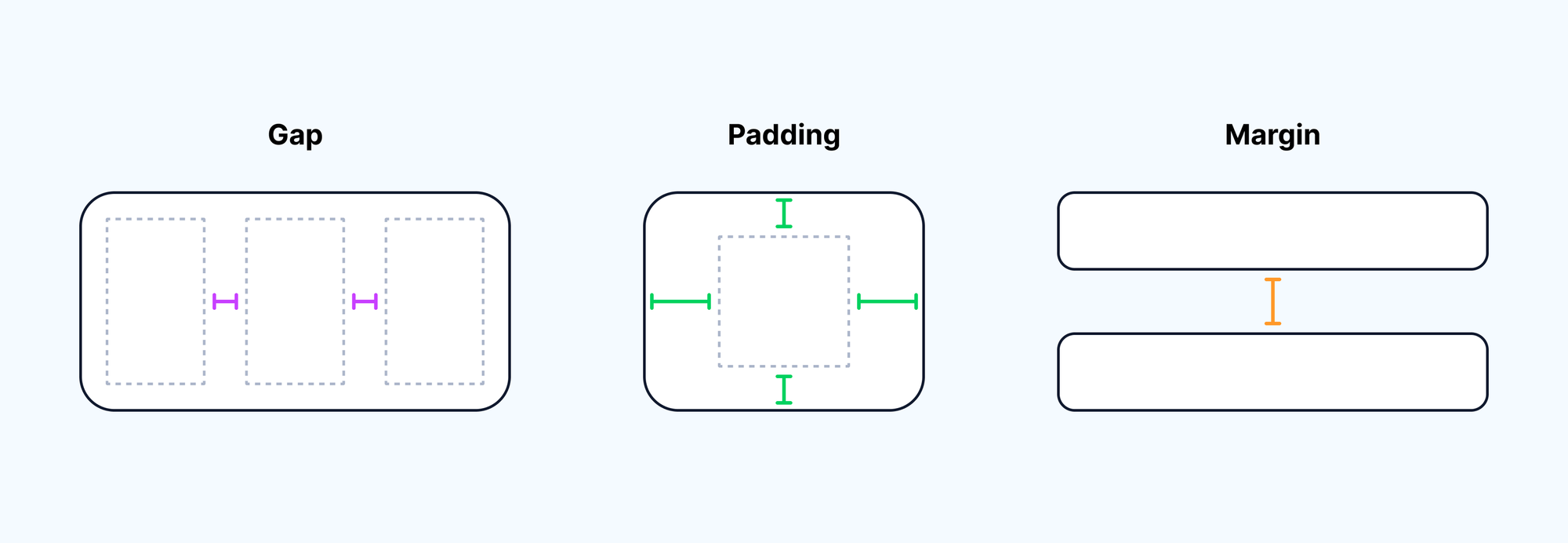
Gap refers to the space between two adjacent elements, such as columns or rows. This property allows defined space between internal elements, making the design more visually appealing and easier to read without setting spacing for each element inside the parent component.
For example, you create a container containing several components and want to separate them. In this case, the best way to separate it is to define the parent container’s gap properties.
Gap Usage
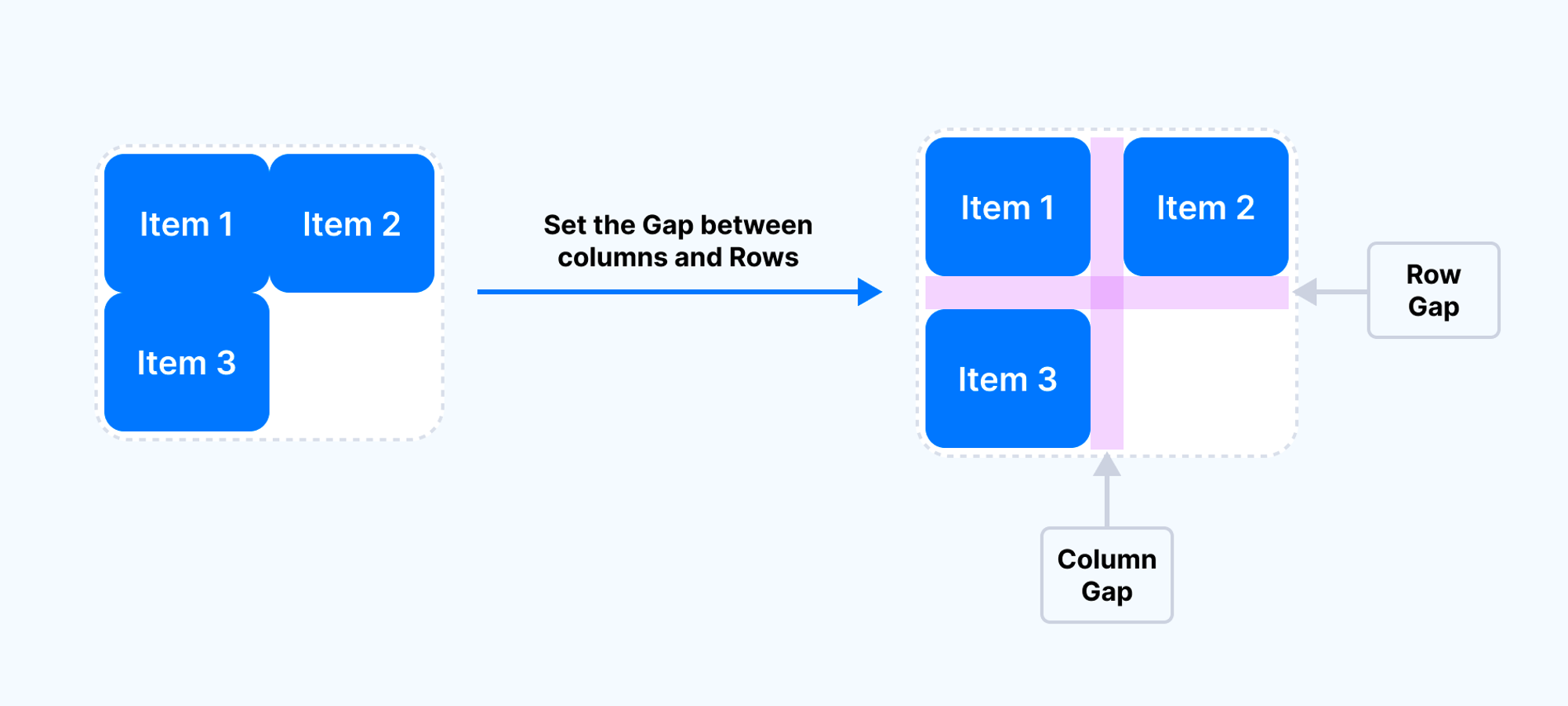
AppMaster uses the Row Gap and Column Gap properties in the Container and Grid UI elements.
By default, Gap properties are set to 0. To change the default values, select:
- Select the element that contains the target elements to separate.
- Go to the appearance settings sidebar.
- Enter Row Gap and Column Gap values in the container’s base setting group. It can be set in pixels and percentages. Negative values are invalid.
To see how to work both gap properties simultaneously enabled the Wrap property.
Padding
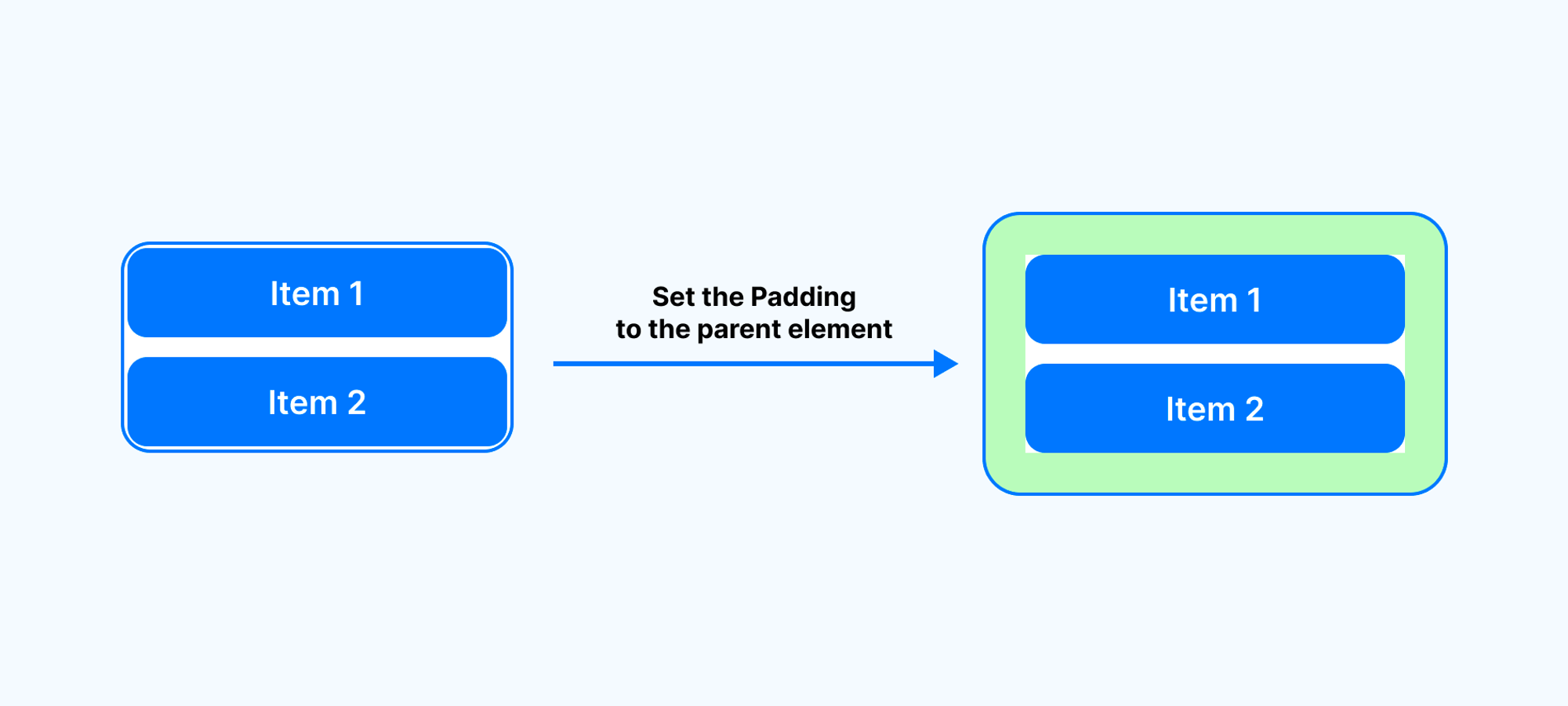
Padding refers to the inside element’s space between the content and the border of this element. Padding is used to create a space from the internal content to the element border.
For example, if you are designing a form and need to add space from fields to the container’s borders — just add padding to the parent container where fields are placed. For another example, if you create a card and want to add spacing around internal content add padding to the card container.
Properties
Available properties for specifying the padding for each side of an element:
- Padding Top,
- Padding Right,
- Padding Bottom,
- Padding Left.
Padding Usage
In the AppMaster, you can set padding almost for all UI components available in the editor, including Container, Grid, Text blocks, Form items, Image, Icon, Button, etc.
UI elements can have individual default Padding values. To change the default values:
- Select the target element.
- Go to the appearance settings sidebar.
- Scroll to the Spacing group.
- Enter the necessary values in the Padding fields. It can be set in pixels. Negative values are invalid.
If the element with setting Padding has a background image or color, padding space will also fill with it. The border will draw around defined padding.
Combine Padding and Spacing to create logical padding for your application elements. This will enhance your app’s aesthetic appeal without negatively affecting its appearance.
Margin
Margin refers to the extra space around an element, between it and neighbor elements in the design. Margin defines space between different elements in the application interface or separate elements placed at the same nesting level.
For example, if you have two paragraphs stacked on top of each other in a container, you can increase or decrease the space between them, making it clear to the viewer where one paragraph ends and the next begins.

Properties
Available properties for specifying the margin for each side of an element:
- Margin Top
- Margin Right
- Margin Bottom
- Margin Left
Margin Usage
In the AppMaster, you can specify margin as well as padding for almost all components (Container, Grid, Text, Form items, Image, Icon, Button, etc.). Both properties are placed in the same setting group.
UI elements can have individual default Margin values. To change default values:
- Select the target element.
- Go to the appearance settings sidebar.
- Scroll to the Spacing group.
- Enter the necessary values in the Margin fields. It can be set in pixels.
Margin will be added outside the component border and background color or image doesn’t fill this space.
 Never use Margin instead of Gap or Padding (including setting up spacing from screen edges). This can cause unpredictable behavior of elements on the screen and incorrect element sizes.
The Relationship Between Gap, Padding, and Margin
Gap, Padding, and Margin are not the same, although they have some similarities. Understanding their differences will help you use them effectively in application design.
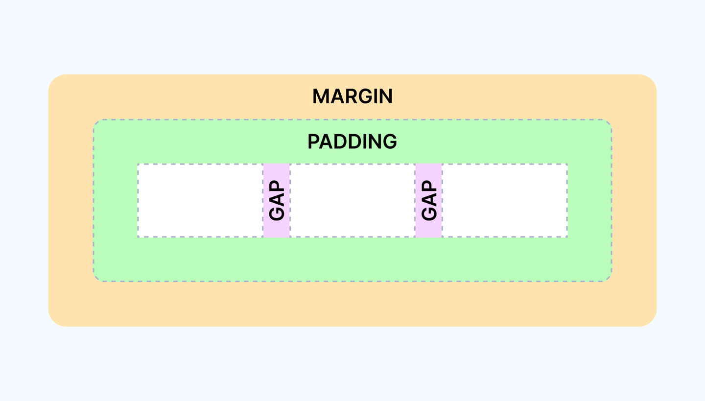
- Gap is the space between internal elements within a container or grid. It helps to create a separation between elements and make the interface more visually appealing and easier to read.
- Padding is the space between the element’s content and its border. It creates whitespace between the content and the border and makes the element more visually appealing.
- Margin is the space between an element and other elements around it. It helps to create space between elements and prevent them from overlapping.
So, remember the relationship between these three properties and use them effectively to create a successful application.
Summary Tips
Now that we have covered the basics of gap, padding, and margin, let’s discuss some best practices for using each of these spacing types in your designs:
- Use a consistent spacing size throughout your design to create a cohesive look and feel.
- Use Gap when you need to define equal space between all internal elements.
- Always use Padding when you need to define a space inside the component for internal content.
- Use Margin only for control space between one-level items.
- Never move internal content from the parent container border with a margin instead padding.
- Never use a margin instead of padding to add space inside the component to his content.
With these tips in mind, you can create a more professional app look in AppMaster Application Builder, and your designs will be both functional and beautiful without unpredictable interface behavior.
Overall, effective use of spacing can greatly improve the usability and accessibility of a design, making it easier for viewers to engage with and understand the content.
Conclusion
In conclusion, Gap, Padding, and Margin are essential for creating professional designs. By understanding when and how to use each of these types, you can create visually appealing and easy-to-understand designs.
Understanding the differences between Gap, Padding, and Margin and using them correctly in the AppMaster Editor can help you achieve the desired visual effect and make your app more user-friendly.
So, keep in mind the relationship between these three properties and use them effectively to create a successful application.
Let your application become something you’re so proud of!
Frequently Asked Questions About Margin vs Padding vs Gap in AppMaster
Is Padding the Same as the Margin?
No, Padding is not the same as the Margin. It’s an essential thing to understand during the design development process. Correct usage prevents unpredictable behavior and incorrect displaying.
What’s the difference between margin and padding?
Padding is the element’s personal space or space inside the border. On the other hand, the Margin is the space around the element or the whitespace between the element to its neighbor.
Is It Better to Use Padding, Margin, or Gap?
There is no one better than the other. It all depends on the design or application layout use case.
- If you want to add a whitespace for the area around the content but not outside the content’s box, use Padding to achieve that.
- If you want the top and bottom whitespace for the elements, you can use the Margin.
- If you need to separate internal elements in one parent with equal space, use Gap.